New Status Update Interface for Simple In/Out Android
November 8, 2021
Over the past few months, we’ve been working on a new status update user interface for Simple In/Out on Android phones. After a Public Beta period, the app update is now available to everyone. We’re excited to talk more about one of the most significant user interface changes we’ve made for our phone users.
We started with a core question: how could we make it easier to see your status and perform status updates while inside our app? Historically, we’ve always had a Status tab. This tab displayed your current status, scheduled statuses, and all the interface elements to perform updates like Quick Picks. But this interface suffered from usability issues. Primarily, new users would often confuse the list of Quick Picks with their status history. Because Quick Picks would automatically populate with recent activity, this wasn’t unreasonable. Even new employees of Simply Made Apps would make this mistake.
Now in Simple In/Out for Android, we’ve reorganized the user interface to simplify the experience.
New tabs with clear meaning
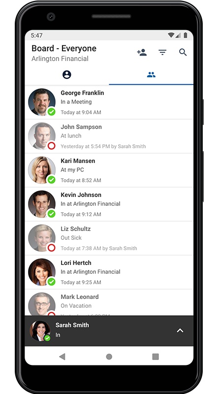
The Status and Settings tabs have been replaced by the new Profile tab. The Profile tab is a better Status tab. It displays clear access to your Scheduled Statuses and your settings. We’ve also elevated the user’s status history to a first-class citizen on this tab. Users no longer need to find themselves on the board to view their past status updates.
We’ve maintained the QR code (if you’re using TimeClock) and an Update Status button to ease the transition away from the old Status tab.
More places to update your status
Updating your status has never been easier with our new status flyup. Visible on all tabs, the new status flyup displays your current status at all times. With a tap or swipe up, you can perform status updates from inside the flyup. You can tap once to update your status, utilize Quick Picks, or type a custom comment. When completed, we’ll slide the status flyup away so you can get back to work.
When it comes to typing a new status comment, we’ve done away with the words “in” and “out” in a “tabbed” UI element which was difficult to understand which status was selected. Instead, there’s a dropdown menu complete with our in/out symbols and color. This will look familiar to any users of the new Simple In/Out Desktop.
Improved Quick Picks
To make Quick Picks useful, Simple In/Out has always automatically populated them with status updates you’ve made recently. If you don’t want to curate your Quick Picks, this saves a lot of work. If you do wish to curate your list, however, this was tricky. We allowed for favoriting a Quick Pick so it remained at the top of the list, and we allowed for deleting a Quick Pick so it would disappear. Deleting a Quick Pick was always a cop-out on our part. If you update your status with the same comment again, it will just come back.
The new My Quick Picks is 100% curated by the user. No more favorite Quick Picks, instead we provide a list that only you control. We can do this because we’ve added a separate list of Quick Picks called Recents. Recents is our non-curated list of status updates that you can reuse to update your status. It’s the best of both worlds. Now your curated Quick Picks can be managed without Simple In/Out automatically adding to it. If you don’t want to manage Quick Picks, Recents provides what users have always had: a list of likely-popular status updates to reuse.
Summary
All of these changes combine to make Simple In/Out easier to use, especially for new users. We now offer more interface labels/hints, more places to perform status updates, and more control over behavior all while displaying less to the user. We hope to bring these changes soon to the iPhone, Desktop, and simpleinout.com.
As always, we’d love your feedback and welcome your questions. Send us an email anytime.